


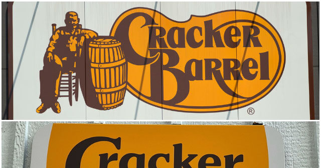
Cracker Barrel’s stock price fell by double digits this week after the company unveiled a new logo that removes the chain’s signature barrel and seated figure, marking the first major design change in nearly half a century.
CNN reported that shares of the company ‘nosedived more than 12%’ on Thursday following the rollout of the company’s new logo, which eliminates the image of a man sitting beside a barrel and instead features only the restaurant’s name in brown text on a yellow background. Marketing experts told the outlet that the decision could risk alienating loyal customers if the company fails to communicate the changes effectively.
The redesign is the first time in 48 years that the logo has not included the iconic illustration. The original Cracker Barrel Old Country Store, opened in 1969, featured a text-only logo before adding the barrel and man in 1977. Company leaders said the new design is part of a broader $700 million transformation plan aimed at modernizing the brand.
CEO Julie Felss Masino defended the changes, telling ABC News, “People like what we’re doing. Cracker Barrel needs to feel like the Cracker Barrel for today and for tomorrow — the things that you love are still there. We need people to choose us, and we want people to choose us.”
In addition to the logo update, Cracker Barrel has begun overhauling its restaurant interiors, replacing dark wood and country-themed trinkets with lighter designs, while also debuting new menu items and advertising campaigns.
The rebrand has drawn heavy criticism on social media, with one user comparing the logo change to Land O’Lakes butter, while others voiced broader frustration that the redesign stripped away a recognizable piece of the brand’s identity.
Despite the backlash, Cracker Barrel maintains that its renovations and updated branding will help the 56-year-old chain regain relevancy with new generations of diners.
Read the full article here


